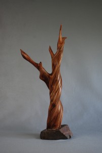
The “Seeing Eye”
“We are partners with Mother Nature. Nature created the basic shape and original design, and we, as sculptors, define and refine it. We clean, smooth, shape, and enhance what Nature started.” Lucile Worlund
Learning to recognize a potential sculpture in a found piece of wood is what we call developing the “Seeing Eye”. It begins with the choice of wood. Learn to be selective.
There are certain forms that make attractive sculptures and which we should look for in our wood hunts. These include: square, triangle, ball, crescent, modified S, open spaces, or a combination of any of these.
The wood often indicates a figure of some sort, creates an attractive abstract, or has an unusual texture or shape. An abstract is a sculpture without an established form, figure or design, but with artistic lines. A good sculpture must be balanced and pleasing from all angles, although, many pieces have a definite front and back, and others may become wall mounts, thus, only having a front.
Grain, texture, and color are important, but a true sculpture should have a worthy design interest. This can be highly complex or of the simplest lines.The following are certain elements and composition principles that may help in developing the ability to see a potential sculpture in a piece of raw wood.
Definitions:
Vertical Lines – perpendicular to the plane of the horizon; straight up and down.
Horizontal Lines – parallel to the plane of the horizon.
Oblique – slanting or diverging from a straight line
Diagonal Lines – extending on an angle between opposite corners of a square or rectangle.
Kinetic – referring to the feeling of motions perceived in a figure; that which seems to produce or arise from motion.
Concentric – refers to shapes having a common center, most often that of spherical shapes, such as ripples in water from a tossed stone.
Eccentric – reflects deviance or departure from the center, not having the axis exactly in the center; irregular; out of the ordinary; capricious.
Composition Principles:
Horizontal/Vertical
-Often depict things at rest, or not moving
-Vertical lines express strength and character and are bold.
-Horizontal lines suggest repose, tranquility, and stability.
Diagonal/Oblique
-Depicts energy that is at variance with the law of gravity.
-Signifies objects in the throes of change, of acting or being acted upon.
-These lines appear to rise up (or downward) and create movement.
Curves
-Implies stress and strain, tension and compression
-The very essence of the energy and movement.
-More appealing and interesting than a completed circle because the eye evades confinement.
Spirals
-The purest and most universal form of motion.
-Seen in the growth of trees and vines, found in sea shells and in the petals and seed heads of flowers.
Hogarth’s Line
-An S shaped line used for decorative and compositional purposes.
-Named for the artist, William Hogarth, who considered it the essence of beauty.
Other Compositional Considerations
Focal Point – central point of attention
Proportion – the relation of the size, texture, color, etc. of one portion of the wood to another or to the whole.
Balance – the state of equilibrium of parts, or whole, of the piece.
Harmony – a pleasing combination of all aspects of your piece, i.e., the flow and the balance.
Form – the three dimensional shape, i.e., length, width, and height, of your piece.
Space –a hole, or an open area surrounded by wood.
Rhythm – related to movement or similar harmonious sequences.
Repetition – multiple duplications
Domination – that feature which most imposes itself on your attention; this can either be, or not be, a desired attribute.
Variation – having aspects of something that differs in some respect or respects from another; deviation from the standard.
Opposition – something that is contrary or contrasting in character, direction or place.
Transition – passage from one place to another, usually entailing gradual change or reiteration of rhythms.
Questions to consider:
- Does the piece have an interesting focal point?
- Does the piece have harmony, proportion and balance?
- Do the lines flow artistically from one point to another?
- Will the same lines direct the eye to the focal point?
- Does it have straight or awkward lines that could be eliminated or softened?
- Is there a sense of balance?
- Are you attracted to the piece?
Things to look for:
- Look for round corners, undulating edges, open spaces are attractive.
- Consider the length of points or appendages, no two points should be left the same length.
- An uneven number of elements are better that an even number.
- Cracks can be used in the design.
- Round holes are to be avoided as the eye tends to be drawn to the hole – these can be elongated.
